

Mathematics & Suspicious Statistics
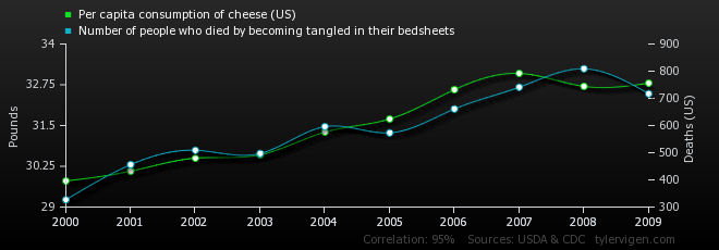
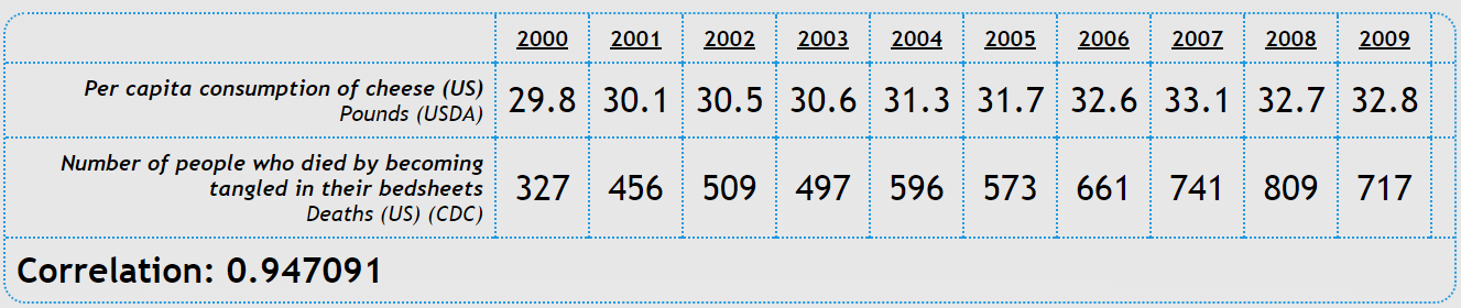
Have you ever wondered about the dangers of cheese? Here in the Netherlands cheese is considered to be harmless, but research has shown that the consumption of cheese is positively correlated with the number of people who die by becoming tangled in their bed sheets. For some of you this might seem highly unlikely, but the numbers do not lie. Or do they?
Statistics play a big role in the Econometrics & Operations Research program, as most of us have painfully realized after some resits. It makes you wonder whether we need such in-depth knowledge, especially as the field of statistics does not have the best reputation. The famous writer Mark Twain once wrote: “There are three kinds of lies: lies, damned lies, and statistics.” Regardless of whether we as econometricians agree with this saying or not, many people around us do question the true power of statistics and whether we can manipulate it. Darrel Huff even wrote a book on this topic (‘How to Lie with Statistics’) and John Ionnadis wrote an essay called ‘Why Most Published Research Findings Are False’. So what is this all about? Is it genuinely that easy to manipulate statistics in order to find significant and more interesting results?
As it turns out, there are multiple methods in which a person can alter their conclusion with respect to the dataset. In this article, I will discuss three of the most common made ‘mistakes’ and explain why we can indeed find such a suspicious correlation between the consumption of cheese and the number of people who die by getting strangled in their bed sheets.
 1. Samples with built-in bias
Let us start with an easy to understand mistake: a sample that is not representative due to a built-in bias. Almost any questionnaire will not be answered to by the entire sample and will hence have a probability of not giving the complete correct results. The perfect example for this situation is the questionnaire with only one question: ‘Do you like to answer questionnaires?’ No need to explain why this will very likely result in a biased conclusion.
This is, of course, a very clear example of which most are capable of seeing its incorrectness, but other samples can bias themselves in such a way in real life as well. Another example comes from an old news report which stated that ‘the average Yale man, Class of ’24, makes $25,111 a year’ (which was quite the amount back then). Irrespective of how great this seems for those Yale students, we should be critical of this rather impressive figure. First of all, it seems somewhat strange that the number is so very precise, as even exactly knowing your own income is not so probable. This probability even decreases for larger incomes, as they are often not solely generated by salary, but also for instance by scattered investments.
But even when we disregard this factor and assume that everybody knows his precise income, the news report has only received the numbers of what people said they earned. As we all know, quite some people overestimate their earnings (for instance due to optimism) whereas others underestimate it (for instance due to income-tax). Since we do not know the sizes of these groups, nor what percentage of their income they add/subtract, we cannot make a sophisticated guess about the actual Yale incomes given the reported Yale incomes.
Besides these disturbing factors, we should also take a look at the sample of respondents. Obviously not all Yale men of ’24 could be reached after twenty-five years and those who did receive the survey did not always respond. Logically thinking, it seems likely that those who could not be found are the less wealthy alumni; the addresses of the big-income earners are less hard to come by. Furthermore, the people with higher incomes are more likely to respond as they are more proud of their accomplishments. Therefore this sample has omitted two groups who were more likely to depress the average of $25,111.
Hence also for this survey, which seems much more reliable than the ‘Do you like to answer questionnaires?’-survey, it seems that the outcome is not representative either. The outcome in fact gives the average income of the very specific group of Yale men whose addresses were known and who were willing to participate, when we assume that they knew their precise income and did not lie about it. So much for a non-biased sample.
2. Misleading visualizations
Whenever there are too many variables, functions or data points, and we can no longer see the forest for the trees, there is an alternative. Especially students who follow(ed) the course Games and Economic Behavior should be very aware of this alternative, as prof. dr. Peter Borm puts it: “What do we do? We make a picture!” Indeed, visual representations can be very useful when searching for trends and correlations, but they can be misleading as well.
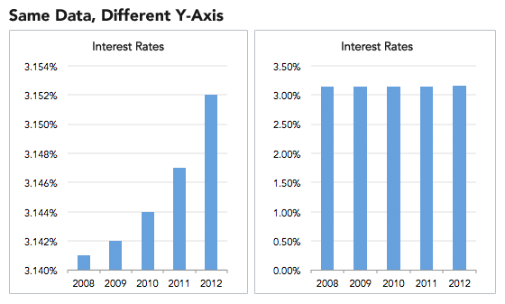
There are numerous ways in which visualizations can be manipulated. One of the easiest examples is the truncated graph (also known as the torn graph), where the y-axis does not start at zero. Figure 1 consists of two graphs with precisely the same data for different y-axes. It is clear from the right chart that the seemingly major differences in interest rates in the left chart are not so significant at all.
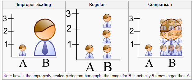
Another example of creating a distorted graph is by using improper scaling. For this, let us divide the EOR students in Tilburg in two groups: all the students who passed the course Statistics on their first trial (group A) and all the students who did not pass the course Statistics on their first trial (group B). In this completely fictive case, it turns out that group B includes precisely three times as many students as group A. A visual representation can be found in Figure 2. Obviously, the middle image is the correct way of picturing this situation, but the left image is more commonly used. Even though we can see that the size of the group B visual is indeed three times as tall as group A’s visual, this does give a distorted view on reality. The right image shows that the area of group B’s visual is in fact nine times as big as the area of group A’s visual, hereby dramatizing the results and hence manipulating the reader.
There are quite some other methods in which graphs can be misleading, such as omitting data points, using improper intervals, unnecessary use of 3D-plots, etc. In order to determine whether graphs are distorted and to measure the size of this distortion, several methods have been developed. One example of this is the so-called lie factor, which is calculated in the following way:
The mentioned size of effect can be calculated by
 A graph with a lie factor bigger than zero exaggerates the differences in the data, whereas a lie factor which is smaller than zero obscures the changes in the data. A lie factor of one indicates a perfectly accurate and non-distorted graph.
Another method for quantifying the distortion is by use of the graph discrepancy index (GDI): 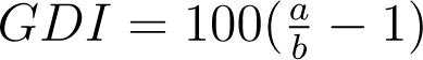 Here a represents the percentage of change depicted in the graph and b represents the percentage of change in the data. The GDI ranges from -100% to ∞%, where 0% indicates a perfectly accurate graph and anything outside of a ±5% margin is considered to be distorted.
There are other methods besides the lie factor and the GDI that seek for the optimal approach of determining the size of distortion, such as the data-ink ratio and the data density. However, we do not yet know the best way of quantifying the misleadingness of graphs and hence we should always be aware of the possible incorrect representation of visuals.
3. Causation or correlation?
When we look at the number of storks’ nest on the roofs of houses in the Netherlands, we can make an estimate for the number of children born in Dutch families. In fact this would be a better estimate than chance would produce and not because of the old myth about storks bringing babies. This is a perfect example of confusion between correlation and causation; there is a third factor involved that causes a change in both the number of children and the number of storks’ nest. The missing link here could very well be that bigger houses attract families with more children and also have more chimneys for storks to nest on.
In this example the incorrect causation is easy to spot, but this is not always the case. A study that shows that cigarette smokers have lower college grades than non-smokers, for instance, is rather difficult to analyze. Is it really true that smoking causes lower grades, or is it the other way around: does scoring low grades result in (starting to) smoke? Or is there a third option?
To avoid such post hoc fallacies, one must be critical of the given statement, as indeed multiple mix-ups can be made.
- First of all, it might be possible that the correlation is merely produced by chance. This can rather easily happen when working with small samples, but might also be looked for by a researcher. A toothpaste producer who seeks nice results to publish for an advertisement can repeat his ‘study’ multiple times and choose to publish only that one that comes in handy.
- Another type of fallacy takes place when there is indeed a cause and effect, but it is not clear which is which. A correlation between income and ownership of stocks might be of that kind. The more stocks you buy, the more money you make, and the more money you make, the more stocks you buy; there is not one clear cause and effect.
- A third type of misconstruction concerns common causes: neither of the variables has any effect on the other, yet there is a real correlation. An example of this is that there appears to be a close relationship between the salaries of Presbyterian ministers in Massachusetts and the price of rum in Havana. This idea is so farfetched that we can easily find the common cause: the increase in price level of practically everything. The example mentioned in the introduction concerning the correlation of cheese consumption and the number of people getting strangled in their bed sheets is a less obvious and trickier form of post hoc fallacies by deleting common causes.
“There are three kinds of lies: lies, damned lies, and statistics”
Dealing with suspicious statistics
There are quite some other manners besides biased samples, misleading visuals and incorrect causations, that can lead to suspicious statistics. For instance, often there is confusion about what type of average is stated in an article; is it the median, the mean or the mode? Or just think about the company who published that their juice extractor ‘extract 26% more juice’. This sounds convincing, until you realize that it is not stated what they are comparing their extractor to. As it turned out, the comparison was made between their extractor and an old-fashioned hand reamer, making it profoundly less spectacular. The same holds for an advertisement that stated ‘Buy your Christmas presents now and save 100%’. Obviously this does not mean that they are giving their products away, as the actual reduction is only 50%.
So how can we handle such misapprehensions? Is there a way in which we can avoid statistical fallacies? As it happens, Darrel Huff (author of the book ‘How to Lie with Statistics’) devised five different questions as to find out how correct a study is.
- Who says so? First things first: search for signs of bias. Are there special reasons for the researcher to wish to find the produced results? Also look sharply for unconscious bias.
- How does (s)he know? Is the sample large enough and non-biased? Are the results significant?
- What is missing? Is all the information available and are no factors omitted? Think about the sample size, standard errors, a sensitivity analysis, etc.
- Did somebody change the subject? Does the conclusion match with the raw figure? Are there no changes made to definitions corresponding to the subject?
- Does it make sense? Is the research based on a proved assumption? Is there no sign of too precise figures or perhaps uncontrolled extrapolations?
With the help of these questions, we can figure out how accurate statistical results actually are. They might not always be completely incorrect, as writer Ron DeLegge stated: “99% of all statistics only tell 49% of the story” and it is our job to find out the truth behind them. So indeed, your first instincts were probably right when you figured that the consumption of cheese is not dependent on the number of people dying by getting tangled in their bed sheets, nor the other way around. Be aware of suspicious statistics!
Literature
- Darrel, H. (1991), How to lie with statistics, England: Penguin Books
- Ionnadis, J. (2005), Why Most Published Research Findings Are False, PLoS Medicine
Text by: Ennia Suijkerbuijk